Showing posts with label color combination. Show all posts

Monday, September 28, 2009

Pantone Color Combos: Purple Heart, Nomad & Rapture Rose

pantone fall - all colors


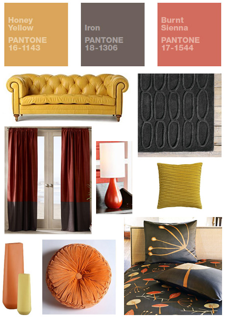
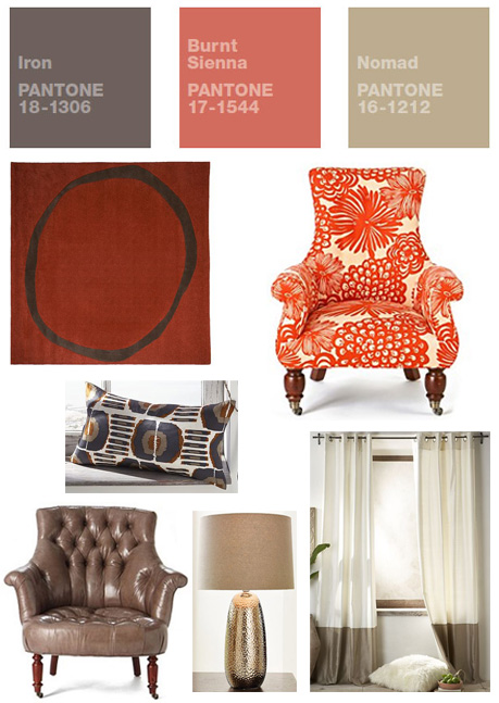
More reader participation this morning joining in on all of this Pantone Color Combo fun. This mood board comes from Anita, a stylist and author of the blog 1richtungsblog. Anita's mood board incorporates two colors that I avoided, Purple Heart and Rapture Rose, and she does a great job with it. I especially love the addition of that beautiful wallpaper.


You can follow this link for a description of Anita's color combination choice and links to all of the shops she visited to pull this look together but since her blog is written in German I will do my best to translate here:  


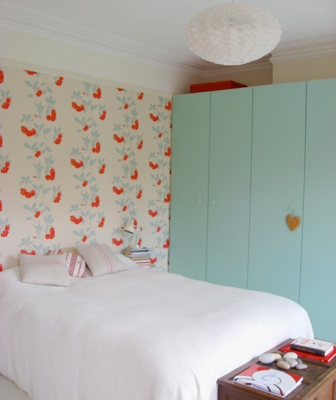
  1. Bring nature into the house with a wallpaper from the wallpaper Agency
  2. Romantic candle with geometric engraving - almost too good to be lit (Zara Home)
  3. Rustic pillows in washed linen provides structure and color to the sofa (H & M Home)
  4. These pillows will provide contrast, cotton sateen (H & M Home)
  5. I love the shape of this sofa - clear lines but somewhat rounded and cuddly thanks to down filling (Bolia)
  6. Genuine mohair throw - Autumn is coming! (Zara Home)
  7. My favorite colors in a pillow! :) (H & M Home)
  8. Slim structured lighting (the red packet)
  9. Rose-colored silk pillows (Zara Home)
  10. For tea lights, perhaps? (Ikea)
  11. Royal wool carpet - oh so glamorous! (Impresssionen)


I really enjoyed going through all of Anita's links because it brought me to so many shops that were unfamiliar to me here in the U.S. I'd love to get my hands on that die cut wool rug, for instance, and when the heck is Zara Home going to start shipping to the United States. 


The particulars: If anyone you would like to contribute a color combination collection please send along the links to your color combo mood board. You can either leave a link in the comments section (if you upload them to flickr or somewhere similar) or you can email the image directly to me at verdugo.designevolution AT gmail DOT com. I'll include your creation in an upcoming post on Design Evolution.


Sign up to receive Design Evolution updates via RSS feed or email.

Thursday, September 24, 2009

Pantone Color Combos: Honey Yellow, Iron, & Nomad

pantone fall - all colors

Alright, keep them coming ladies (and gentlemen, I know there are a few of you out there) these mood boards are so great.  This next collection comes to us from Diana Brennan.  It's no surprise that Diana has a great eye, she has a stunning art photography shop that I suggest you pay a visit.  This color combination is probably the closest to what I would have in my own home.


The bird print in the layout is from Diana's collection and he is such a perfect fit.  The print made me realize that I did not include any art pieces in my collections.  I will have to make sure I do next time.


One a totally unrelated note, Diana has the prettiest calender for sale in her shop.  I've been going back an forth about doing a calendar round up here on Design Evolution because I know many other bigger and better bloggers are preparing them now.  What I might do is pull together a round up of all of the round ups :)  Whatever I decide to do,  you need to at least see Diana's calendar.


I know what you're thinking and yes it does come with the clip board.  How great is that?


I should repeat the details in case anyone else would like to participate: If you would like to play please send the links to your color combo mood board (based on the colors provided here). You can either leave a link in the comments section (if you upload them to flickr or somewhere similar) or you can email the image directly to me at verdugo.designevolution AT gmail DOT com.  I'll include your creation in an upcoming post on Design Evolution.


Sign up to receive Design Evolution updates via RSS feed or email.

Wednesday, September 23, 2009

Pantone Color Combos: Rapture Rose, Warm Olive & Majolica Blue

pantone fall - all colors

I threw a little request in at the end of Monday's post for some reader participation.  I asked anyone who wanted to play along to put together a mood board based on their favorite color combos from the colors found in the Pantone Fall Fashion Color Report.  I'm super excited that someone actually did participate.  These mood boards are from fellow interior design blogger and web friend, Tiffany Melanson (The Other Tiffany).  


I love what Tiffany pulled together especially since she incorporated the rose color in both, a color I hadn't included in any of my collections.  I'm dieing over that Ikat chair in the second grouping.  Tiffany, care you share your sources with everyone?


If anyone else would like to play please send along the links to your color combo mood board. You can either leave a link in the comments section (if you upload them to flickr or somewhere similar) or you can email the image directly to me at verdugo.designevolution AT gmail DOT com.  I'll include your creation in an upcoming post on Design Evolution.

Update: Tiffany included a post on her blog with links to the stores that carry all of the items in her mood boards.  You can find it here.  Thanks Tiffany!


Sign up to receive Design Evolution updates via RSS feed or email.

Monday, September 21, 2009

Color Combination: Inspired by Pantone Fall Fashion Report

pantone fall - all colors

I spent the morning flipping through Pantone's Fall 2009 Fashion Color Forecast and I'm in love with all of the rich colors and warm neutrals they are paired with. Just one quick glance at the lineup of color swatches and so many gorgeous color combinations jumped out at me. If you are having trouble deciding on a color scheme for your home or are not sure which colors will coordinate with which Pantone is a great place to start, the site is full of excellent tools. Don't limit your self to the articles on interiors; fashion trends often translate well in the home. But of course - if they project still seems too daunting you could always ask me for help.

With the fall fashion forecast as my guide, I did some online shopping and found a ton of great furniture pieces and accessories to pull many of these color combinations together.

olive blue creme


In some cases I don't actually intend for every one of these pieces to be used together, I just want to give you an idea of what's out there. By checking out just a few of my favorite online retailers I was able to find furniture pieces and accessories available in every color from the report.

honey iron sienna


As always, the easiest way to incorporate some of the more bold and rich toned pieces is to layer them with a coordinating neutral. For me I find it easiest to have the wall color provide a neutral back drop this way those pieces really shine. If you're decorating on a budget you may also consider keeping all of the larger investment pieces of furniture neutral and utilize accessories like pillows, wall treatments, and rugs to add color to the space. If you are anything like me and your tastes change as often as the tides, having a neutral background allows you to change the look of the space without having to spend too much money.

For a fun exercise that you can all participate in - Pick out your favorite color combination for those found in the color report and put together your own layout options. I'd love to see what you come up with!


Related Posts:


Sign up to receive Design Evolution updates via RSS feed or email.

Friday, July 24, 2009

A Color Combination Update

Thanks to yesterday's color combination post Laura Bobo, designer and owner of the shop Enid, shared with me a few photos or her fab loft space that just happens to contain the aqua and orange combo I was raving about.


I love she is creating a living space that is so fun and vibrant and I can't wait to see the rest of her decorating projects develop. Maybe if we say pretty please, Laura will give us a peak at the rest of her home.

Have a great weekend everyone!

Related Posts:

Sign up to receive Design Evolution updates via RSS feed or email.

Tuesday, July 21, 2009

Color Combination: Aqua and Orange

I had a lot of fun putting together the last Color Combination post and folks seem to have responded positively to it so I thought I would give it another go. Perhaps this can become a regular series, would you like to see that?

It seems I've been drawn to a lot of photographs of rooms containing this orange and aqua color combo. It's so fresh and happy. I enjoy rooms that are punctuated with a lot of white the most. It keeps it from feeling like you are living inside of a Miami Dolphins uniform. I might be cheating a bit with a few of these photos where the color might qualify more as "Martha Blue" then aqua but you get my drift and either combination will work together really well.


Ahhh, this photo - could you die? Wouldn't this be the most beautiful wedding ever?


Is there a color combination that has been grabbing your attention lately? Share away.


Sign up to receive Design Evolution updates via RSS feed or email.

Wednesday, March 25, 2009

A Color Combination Update

Based on the comments I received from the Navy and Teal color combination post, it sounds like most of you agree that those four colors could really work well together. As I mentioned in that post I had a friend in mind when pulling that combination together. The two of us took a trip to Home Depot to pick out the paint and made some modifications to the color scheme. After shuffling around bunches of paint chips the end result is a color scheme that is more subdued than the original but no less chic.

We settled on Porpoise by Behr as the wall color. The color is now up on her walls and it looks amazing. The paint has a tiny hint of soft purple in the gray which I think will look great with the navy.

The turquoise and the blue are coming into the room as bedding, window treatments and other accent pieces. The mustard color was also chosen as an accent however my friend has decided to take the doors off of her closet and outfit it with a great closet system from Ikea. I think it would be fun to paint the inside of the closet mustard so we might give it a try. The best thing about paint is if she hates it we can also re paint it gray. I can't wait to see the room come together. I'll be sure to snag a few photos of the finished project to share will you.

P.S. I swear that I did not purposely match the mustard color to my blog. It was a total coincidence.

Friday, March 13, 2009

Color Combination: Navy & Teal

I don't know what it is about this color combo but I'm crazy about it this spring. For the last remaining wintry months I've been wearing a teal scarf with my navy coat (wishing I no longer had to wear a scarf) and almost all of the new spring items I've picked up recently combine these two colors. I would really love to work this color combination into my decor but I have a total of 3 rooms in my condo and have run out of room to play.
Lucky for me I have a close friend who would like help decorating several rooms in her home. Last time I stopped by I was rather shocked by the paint chips she had taped to her bedroom wall. All of the colors were bold and saturated and seemed a bit overwhelming for a bedroom. After doing some research I may be re-thinking her paint choices and actually think she might be on the right track. If she thinks she shocked me with her paint choices I'm going to totally shock her with my ideas for her room. Something in me really wants to pair this sunny yellow and deep magenta with the navy and teal. Like I told you before, I've got magenta on the brain lately.
Once I put these four colors together the combination felt really familiar. I knew it must have been something I'd seen in a past issue of Domino Magazine. I went searching through their website (don't know what I'll do when they finally shut it down) and found the picture I was thinking of.

I have to admit, I hated this room (really set of rooms) when it first appeared in the magazine. I'm not even sure that I'm too crazy about now. Went back to searching, there had to be a good example of this color combination that would help me sell my friend on it.

Then I came across these two photos. The one on the left is the same color family and while I think it makes for a really cute sleeping nook it still feels too punchy to me for her bedroom. The photo on the right is getting much warmer. The colors are all there but it feels much more sophisticated than the first two pictures. The pink and yellow are subtle accents (the flowers on the table) so you don't feel overwhelmed by so many strong colors and the gray pendant helps to soften things up a bit. However, I'm not sure that I really want to suggest that my friend paint her walls turquoise. She is the type that seems to change her mind often and I'd like to give her something that is more flexible.

I think we have our winner. The teal bedspread looks gorgeous against the soft gray walls. Even the glass lamp has a hint of green to it. I would replace that lamp shade with a navy one and add some colorful pink and yellow pillows to the bed to bring the entire look together. I'll have to find her a small mirrored side table because I love the one in the picture. Too bad she doesn't also have those old fashion radiators. We could paint it a deep navy similar to the one in the photo and it would be fabulous. What do you think about my crazy color combination. Can we make it work?

Check out this post for an update to this color combination.

Sign up to receive Design Evolution updates via RSS or email.

ShareThis