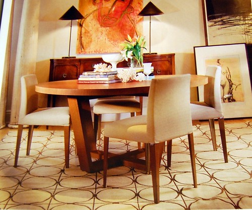
Take a long hard look at this photo and tell me what you think is wrong with it.
That rug is driving me crazy!! This is an advertisement for, among other things in that photo, the rug. I cropped the name of the company out of the advertisement because they've already suffered enough embarrassment. How hard would it have been to set this display and not have the rug be a wrinkled mess? In case you think I'm over reacting, I may have cut some of rug out of the photo when I did the cropping. Trust me it is all a mess. It is difficult to understand why a company would pay so much money to have an ad in a popular magazine and not make sure every last detail was perfect. Okay that's enough crazy ranting for one day. We will now return to our regularly scheduled programing.


To add to that, I'll say that because it's not centered on the circles is kinda driving me nuts, too (but I get funny that way.)
ReplyDeleteThe wrinkles drive me nuts too. And why was it necessary to distort the photo? The horizon line is only slightly off. Horrible.
ReplyDeletethe whole photo is driving me nuts! the table legs being angled along with all the other lines makes the room look sideways - and the naked lady art? in a dining room? blech.
ReplyDeleteWhat a mess! Who approved this shot?!
ReplyDeleteIt's also a cluttered mess. I hate the picture on the floor. And the lamps in the background are fug.